Sprouts
Brand refresh of a national health-focused grocery chain
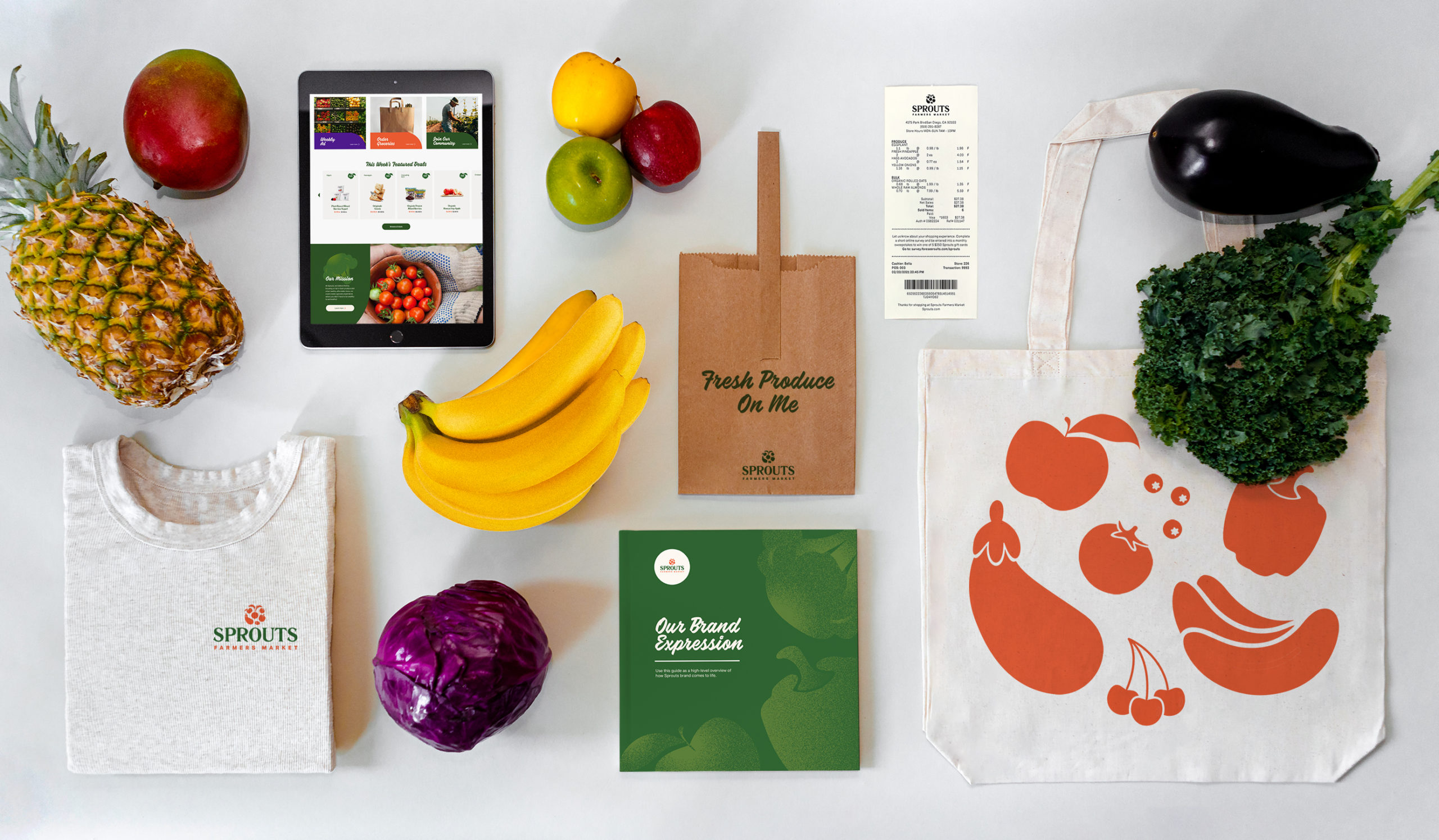
Rebrand, Illustration, Page Layout
October - November 2021
Overview
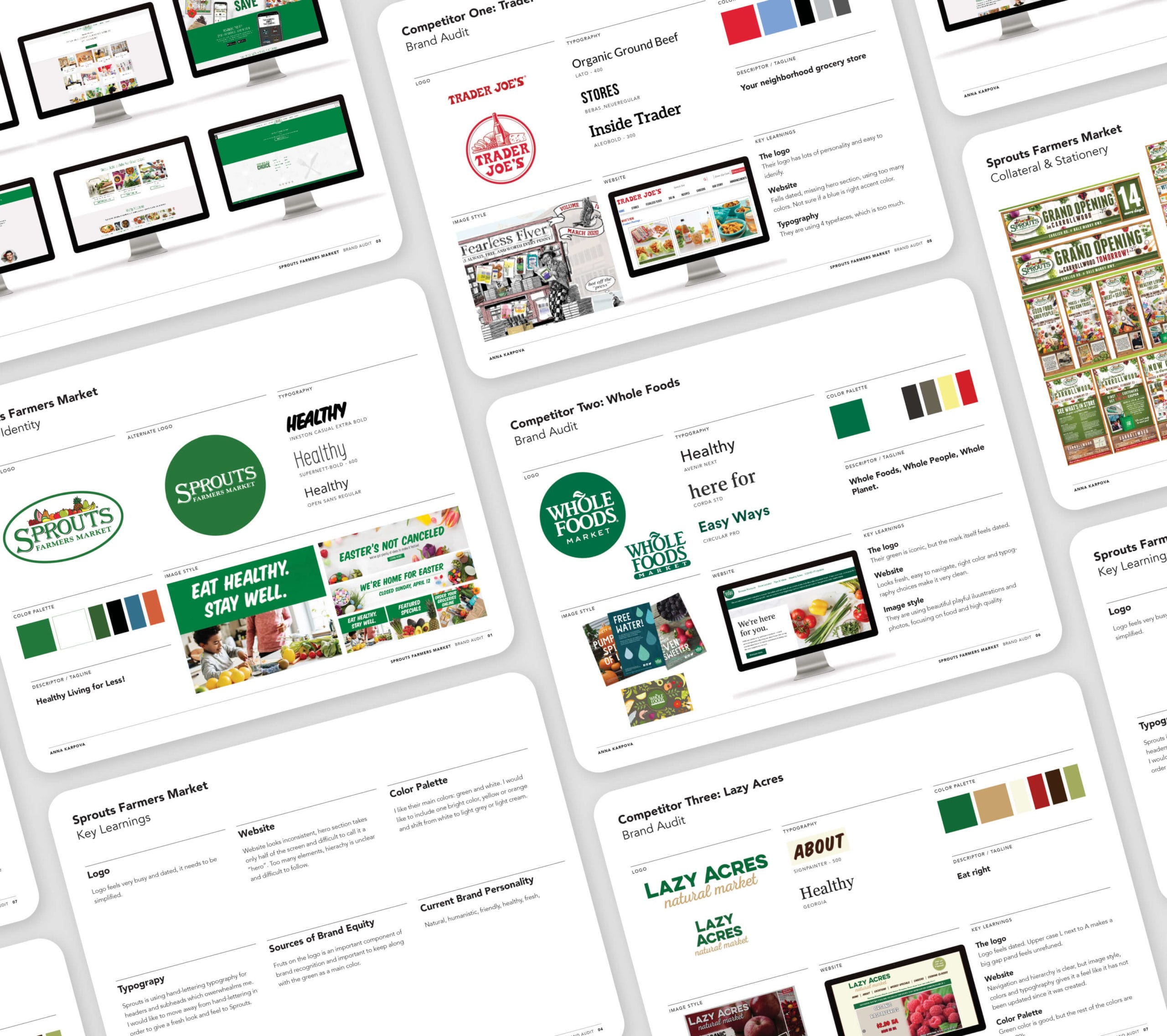
Sprouts Farmers Market is a chain of affordable and healthy grocery stores with locations in 23 states. Offering a wide selection of natural and organic food and an emphasis on fresh produce and bulk foods, Sprouts caters operates with a focus on the environment, community health, and supply chain transparency. Sprouts targets individuals and families who are conscious about the environmental and health implications of the food industry. Sprouts wanted to refresh their dated brand identity system, which didn’t hold up to the key competitors like Trader Joe’s and Whole Foods.
Solution
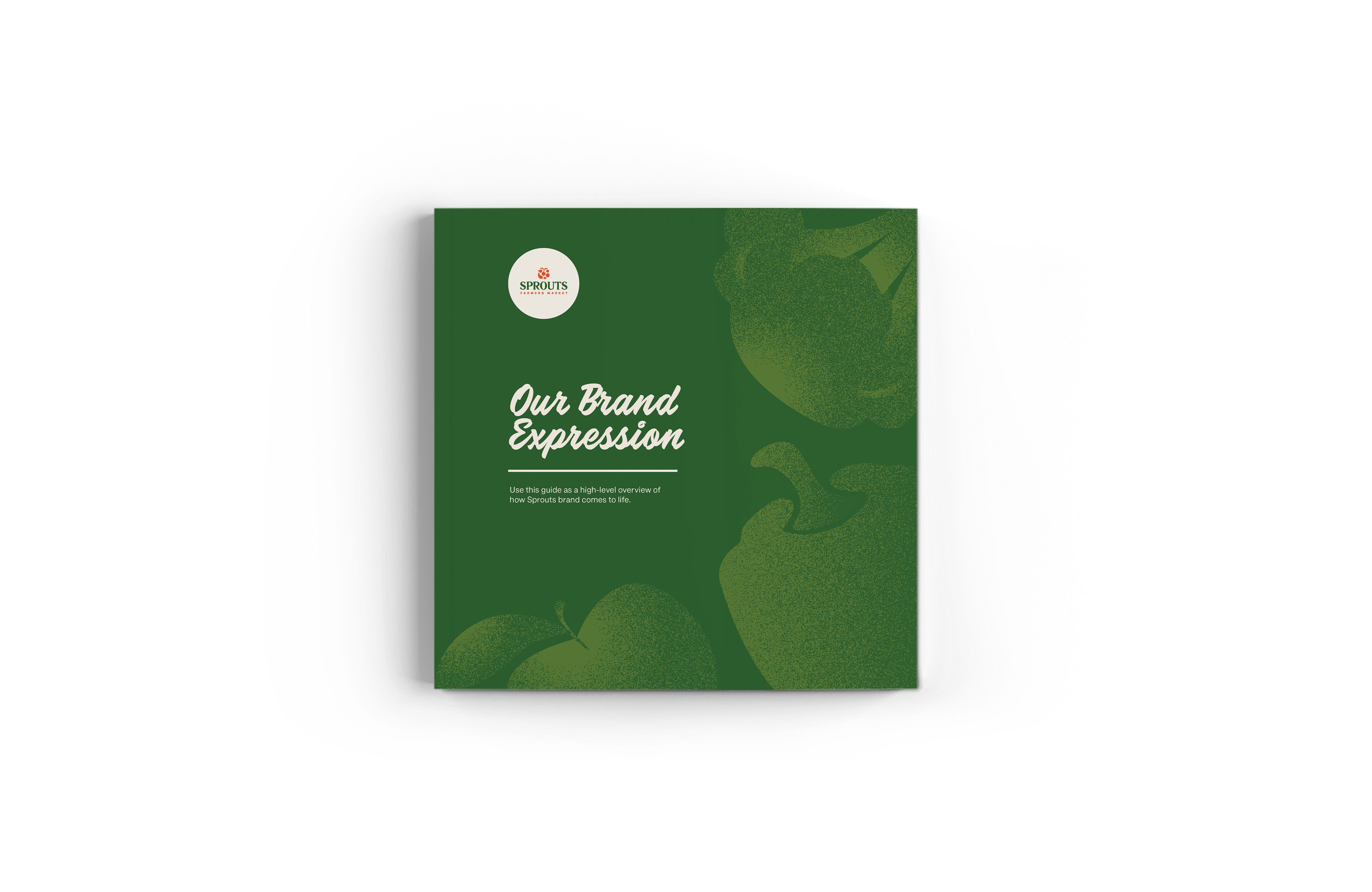
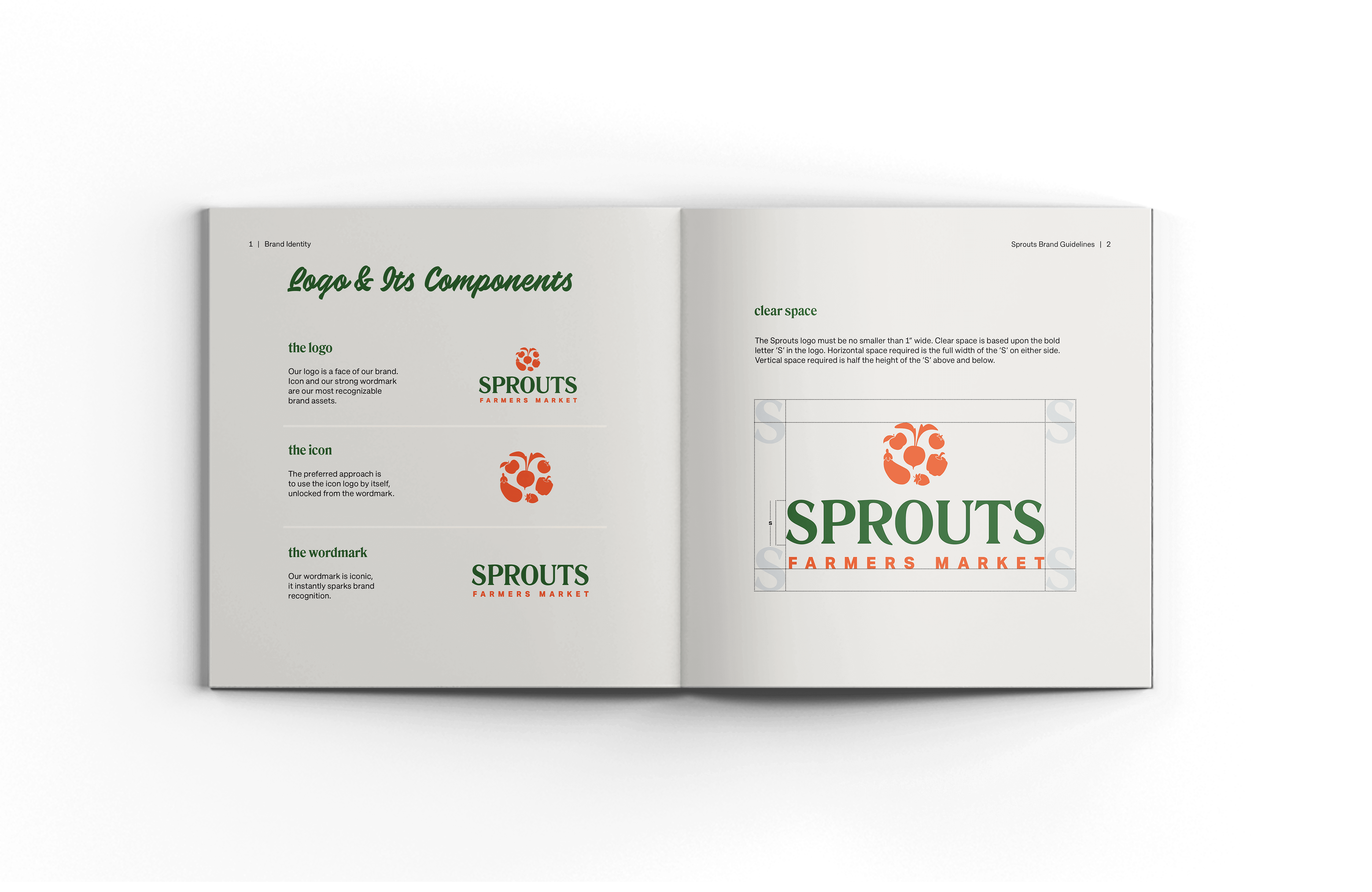
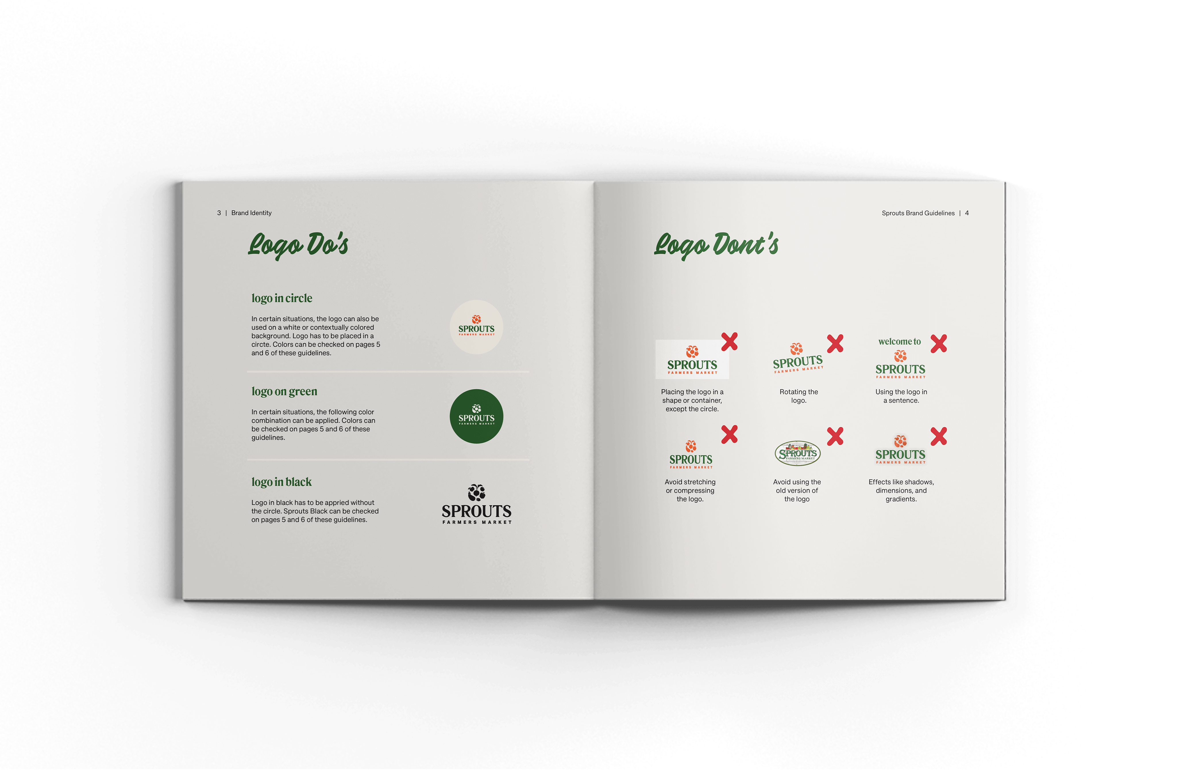
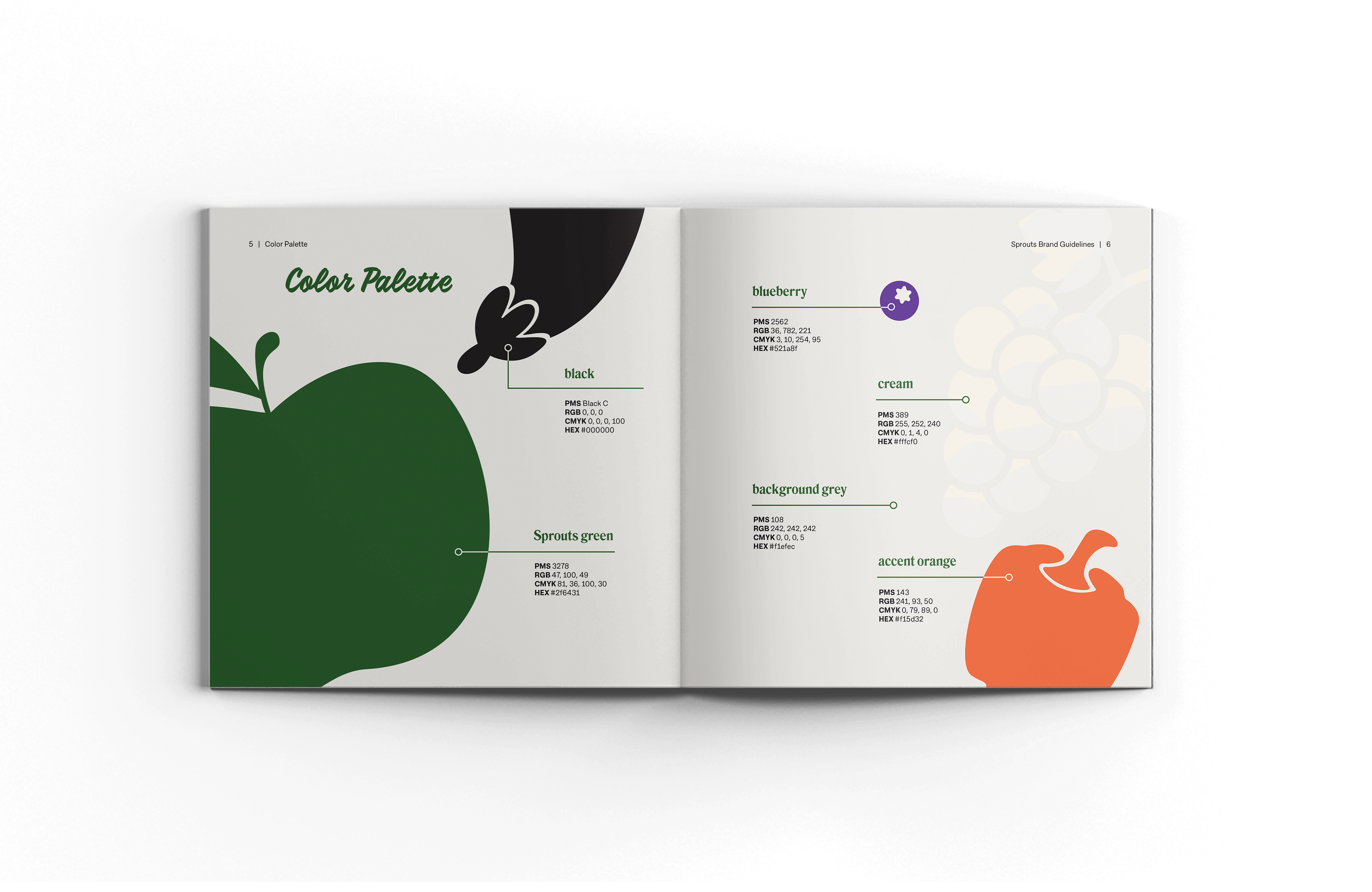
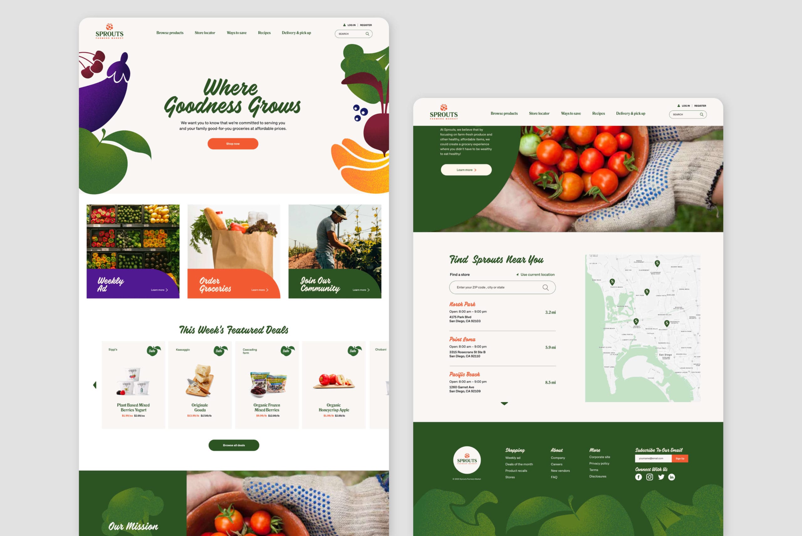
The new Sprouts brand has a fresh and sophisticated look, but preserves its natural, humanistic, friendly, and healthy brand personality. The idea of including fruits and vegetables in the logo was kept to preserve brand equity, but the illustration style was simplified. Green was preserved as the primary brand color, but was softened with a contemporary mix of cream, orange, and purple. Fruit and vegetable illustrations are textured for use throughout the brand. This is paired with fun copywriting in a hand-lettered typeface Calafia for a playful and friendly tone. The Approach type family was selected for body copy for its clear readability but with plenty of character.
Competitive Analysis
Logo Redesign


Other Projects

Fisker OceanHMI, UX, UI

Fisker PEARHMI, UX, UI

FeyaUI, UX, Branding

GamutBranding, Packaging, Typography
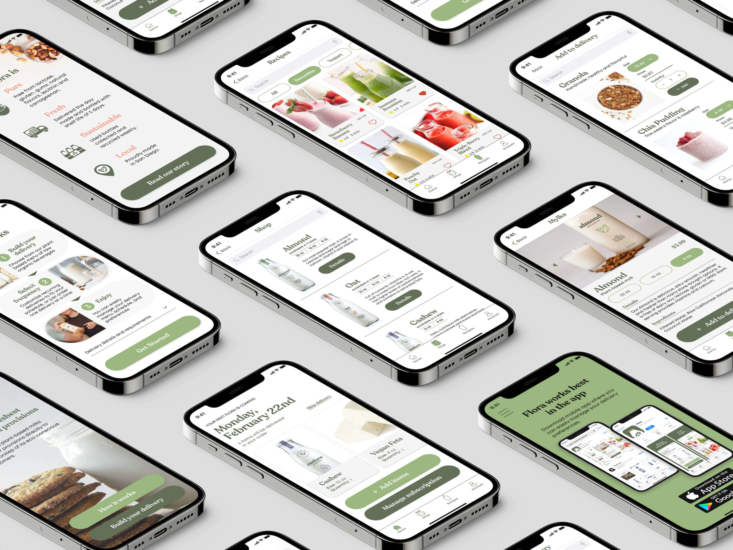
FloraBranding, Packaging, UX, UI

195 HotelBranding, Packaging

99URedesign, Typography, Page Layout

AutographTypography, Page Layout

The Great GatsbyIllustration
© Anna Karpova 2025