Autograph
Interior design magazine featuring celebrity homes
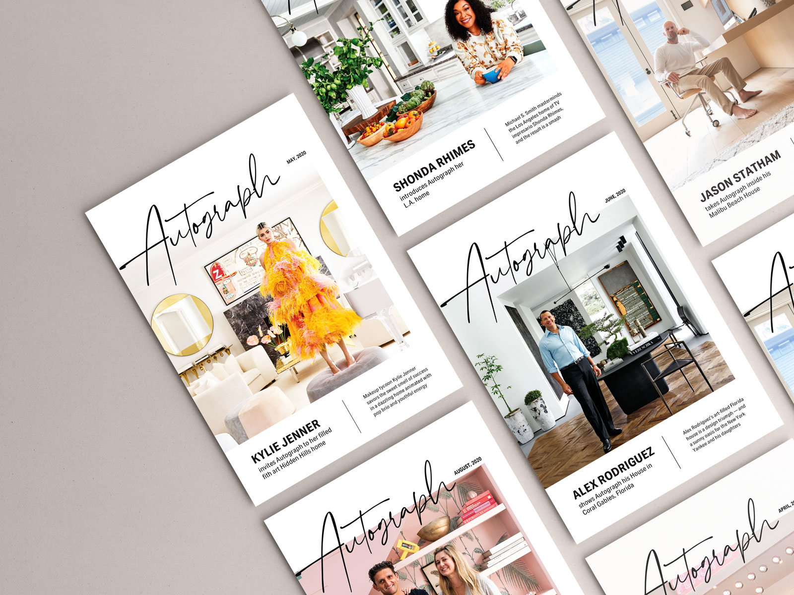
Brand Identity, Typography, Page Layout
March - May 2020
Overview
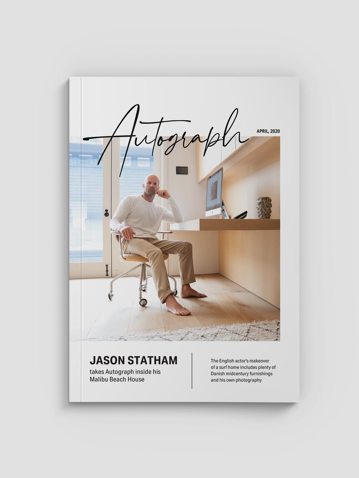
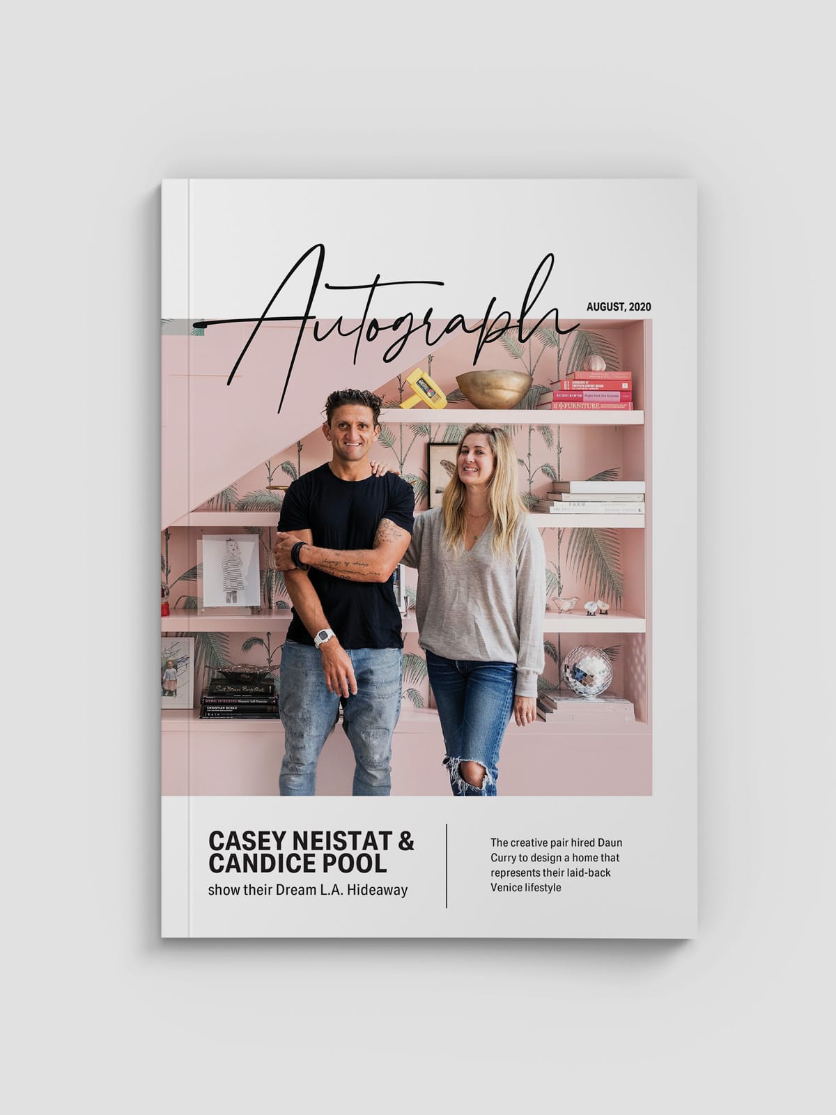
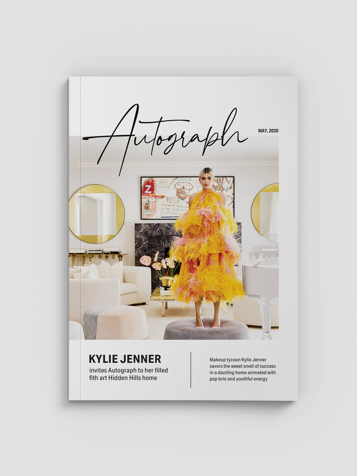
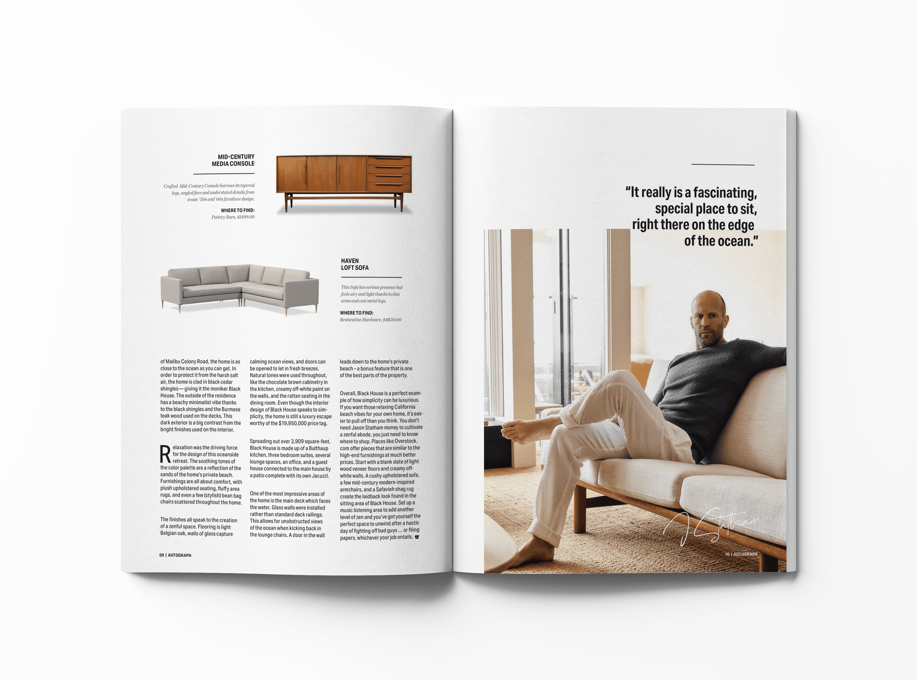
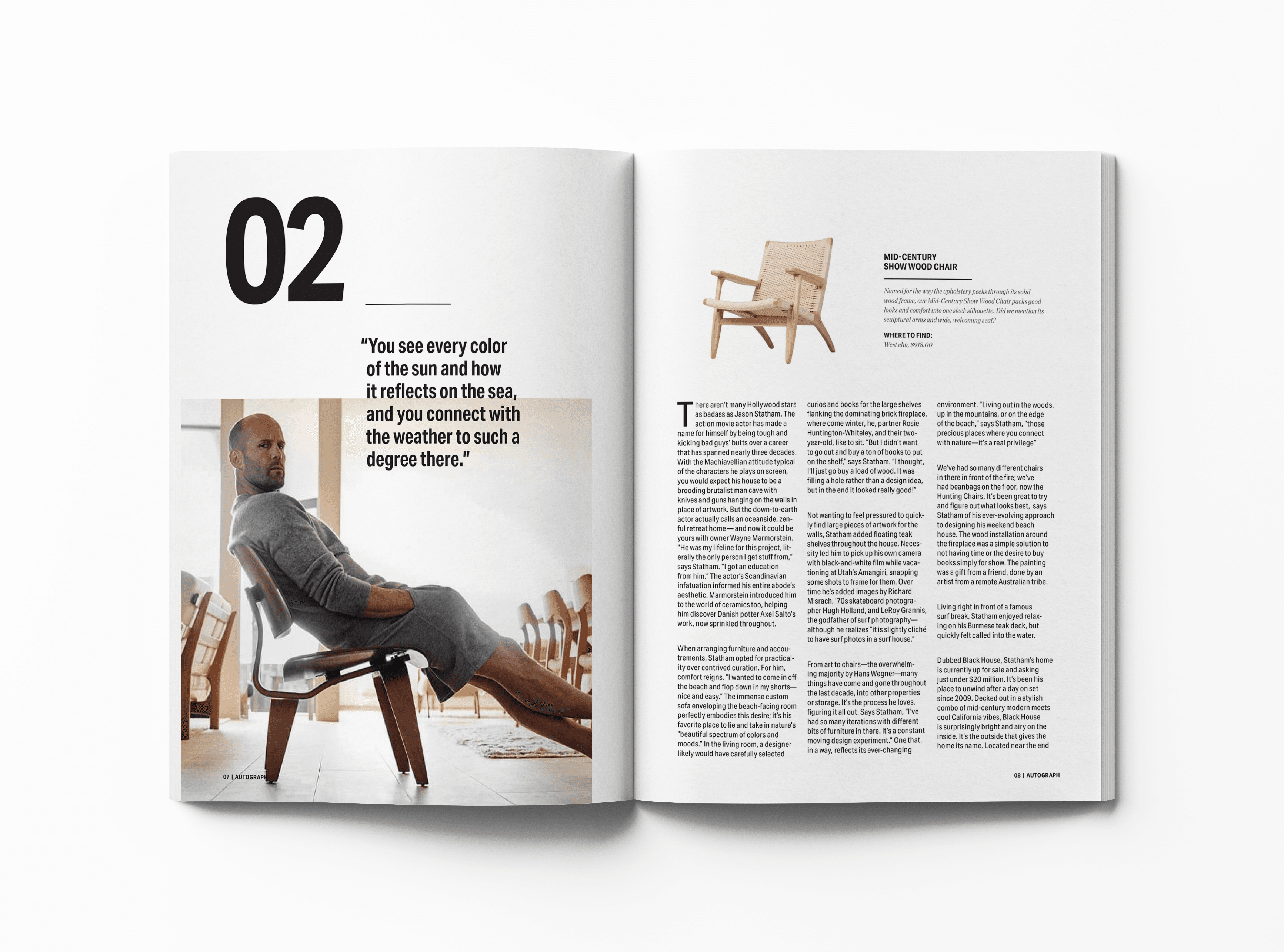
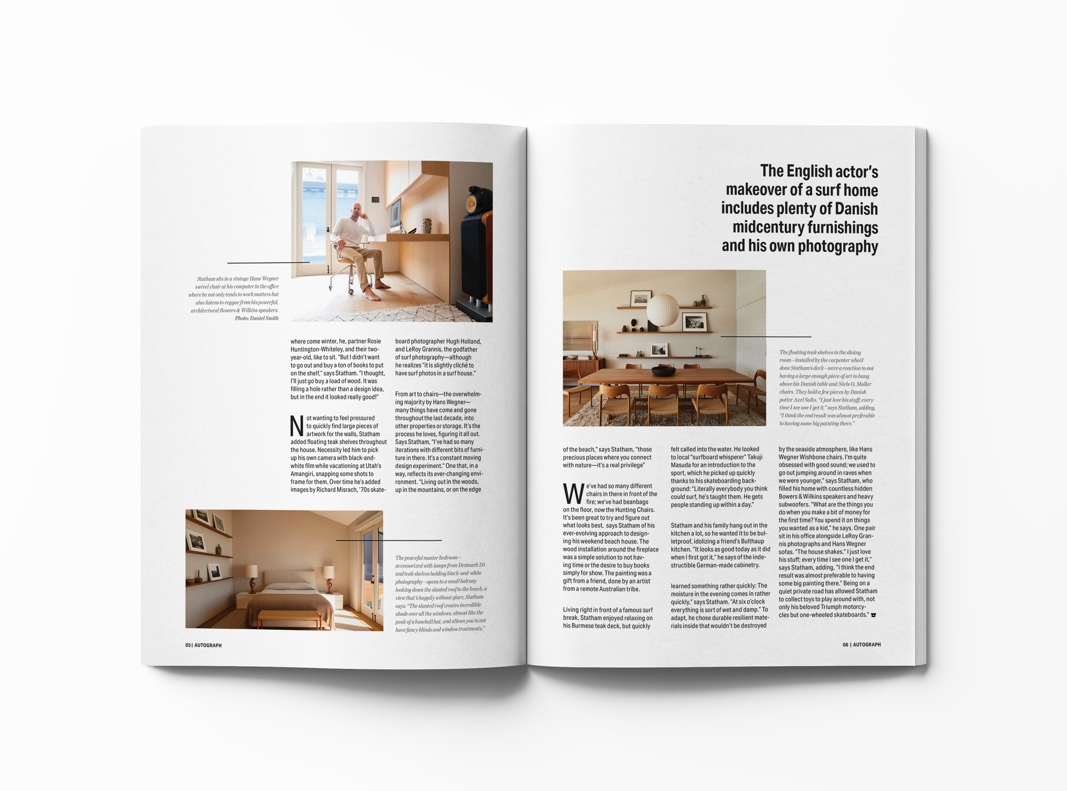
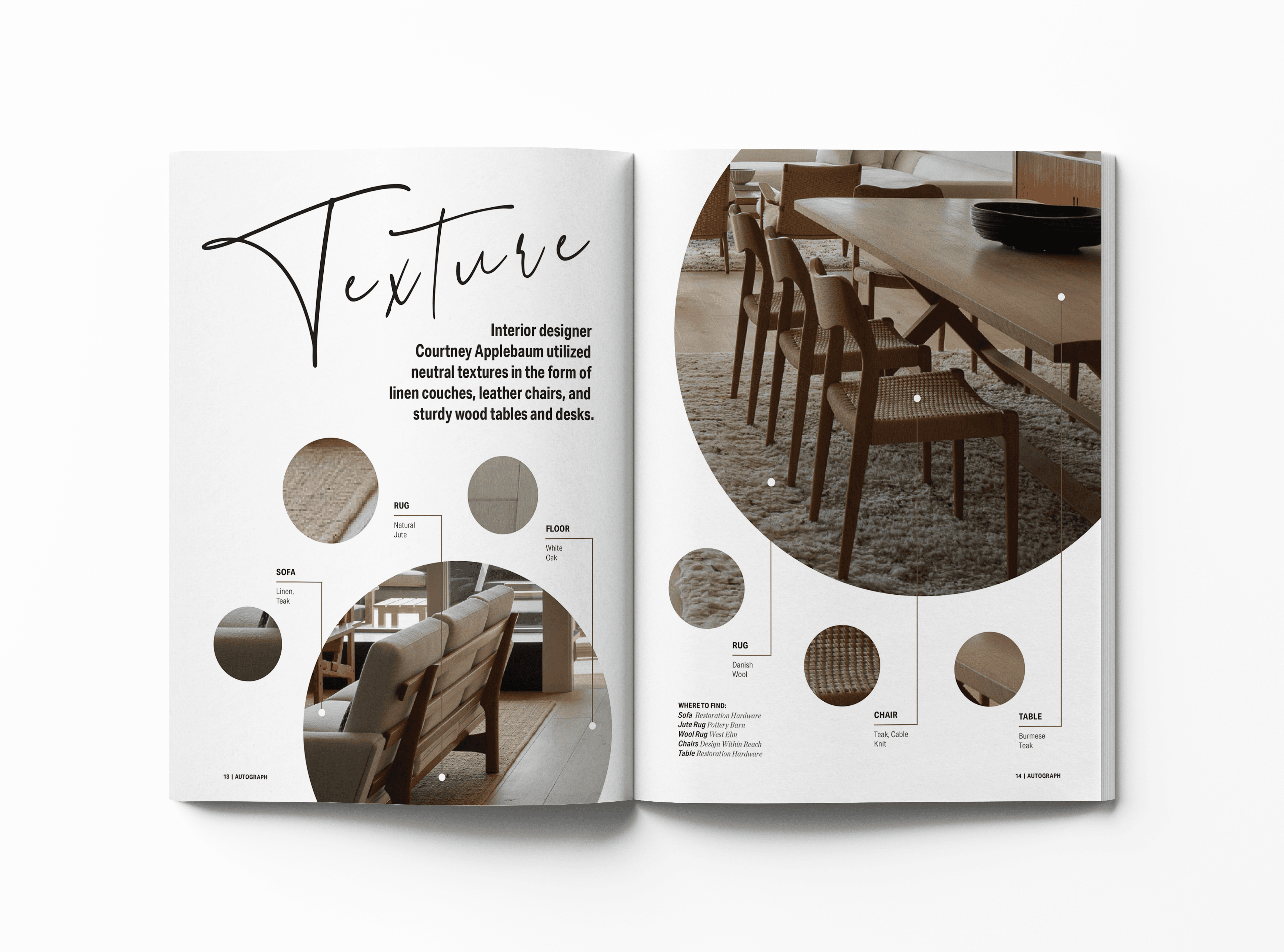
Autograph is a new magazine that features the incredible homes of celebrities. Through a mix of exclusive interviews, photos, and home tours, Autograph is a great place to gather design inspiration and get an in-depth look at celebrity culture. The magazine targets architects, design enthusiasts, and celebrity fanatics, ages 35-45. Autograph dives deep into details and showcases colors, textures, and forms inside featured homes. The magazine gives tips on how to implement certain styles into your own home for both an unlimited or an affordable budget.
Solution
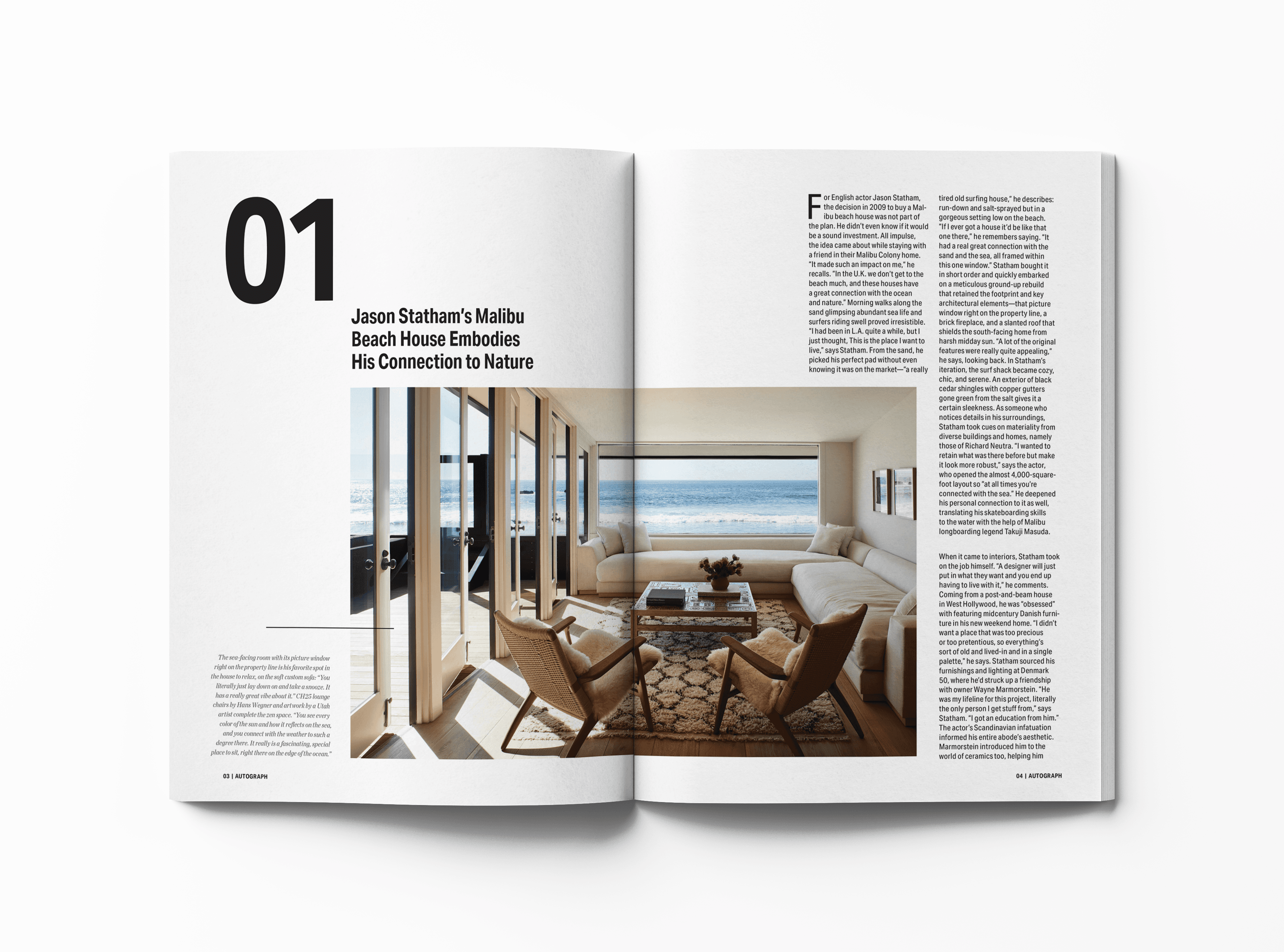
Autograph Magazine uses a minimalistic and clean design with simple shapes and extra white space to help readers focus on the content. The magazine has a black and white color scheme, vivid imagery and large lettering to make content stand out and create an appearance of timeless professionalism. The natural and modern handwritten font Hampshire was used on the logo to represent an autograph. The sans-serif typeface Aktiv Grotesk Condensed was used throughout the magazine to support any message without overpowering it. Serif typeface Chronicle Deck, used for accents, gave strength and utility to the overall layout.
Positioning
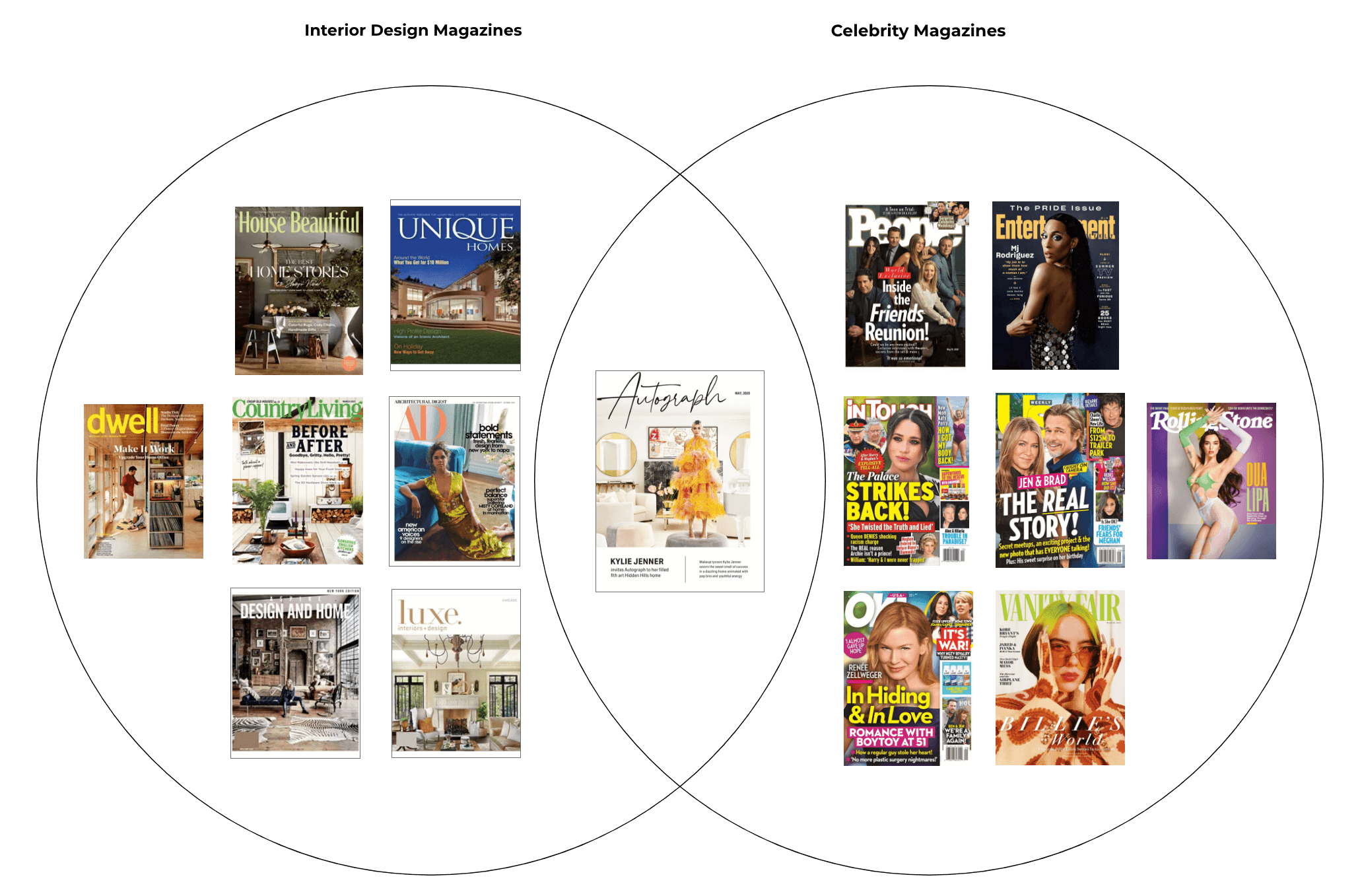
Autograph magazine overlaps two target audiences, interior design industry professionals and celebrity fanatics.
Grid System
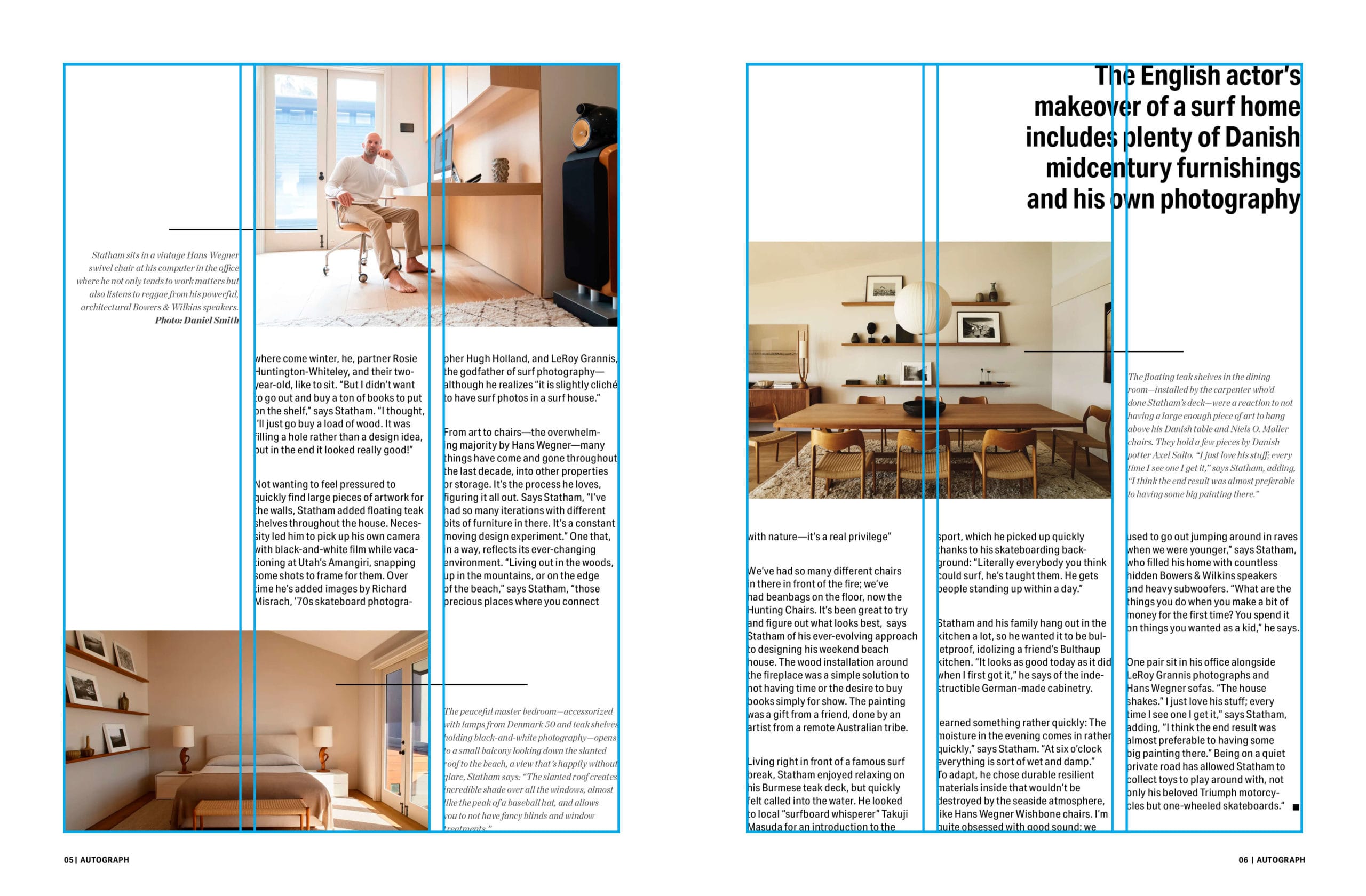
The interior spreads use a classic 6-column grid layout that is flexible and allows for a varied, asymmetrical column structure.

Other Projects

Fisker OceanHMI, UX, UI

Fisker PEARHMI, UX, UI

FeyaUI, UX, Branding
SproutsCorporate Rebrand

GamutBranding, Packaging, Typography
FloraBranding, Packaging, UX, UI
195 HotelBranding, Packaging

99URedesign, Typography, Page Layout

The Great GatsbyIllustration
© Anna Karpova 2025